With Office 2013 preview launched in mid July 2012, there have been ubiquitous posts on the new Power View feature in Excel 2013. This is a very welcomed feature and I would sense that it will win Business adoption as an easy to use and “hopefully” affordable Self Service BI. Here’s my thought on a fairly early version of Power View feature in Excel 2013 Preview.
Power View
Since the first time Power View introduced in SQL Server 2012 and made available in SharePoint 2010, I’ve always been fan of it. With most tools if you have analytical mind and are great with visualization / design, most reports you’ll create will be useful and used – and in my opinion – Power View is definitely one of these tools.
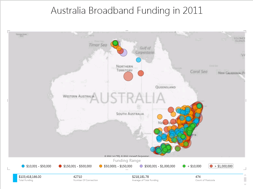
Using the Australia Broadband Guarantee data set provided from http://data.gov.au/dataset/australian-broadband-guarantee/, I am able to quickly and painlessly create an interesting Power View Map in Excel 2013 that I can analyze the investment the Australian government has made, at country level and down to specific Suburbs / Postcodes. The map feature is currently not available in SQL Server 2012 RTM with SharePoint 2010. I do hope that it will be introduced as a Service Pack 1 to SQL Server 2012.
Sample Data and Map
The Australian Broadband Guarantee (ABG) was an Australian Government initiative designed to help residential and small business premises access high-quality broadband services regardless of where they were located. The program targeted premises unable to access commercial metro-comparable services, particularly those living in remote parts of Australia
More information on the project: http://www.dbcde.gov.au/__data/assets/pdf_file/0017/128204/Australian-Broadband-Guarantee-2010-11-Guidelines-July-2010.pdf
The dataset I’m using has a very straight forward data structure. My motive here is to see which areas have the funding gone to? Does the amount of funding yield many connections? Is there any isolated area that gets funding?
Zoomed at the Nation level:
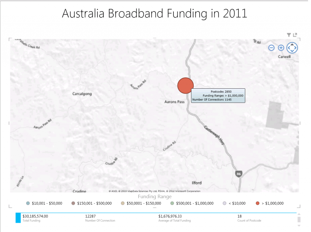
Zoomed at a State level, with funding > $1 million filter: (hovering on one of the bubble gives me a descriptive tooltip)
I can zoomed in further to the actual postcode as the granularity of the location is postcode, as shown below:
Advantages and Disadvantages of Using PowerView Map
Although it’s still at its early stage as Office 2013 is only released in a Preview version, I consider Power View Map feature has the following advantages and disadvantages.
Advantages of PowerView in Office 2013 preview as at the time this post is written:
1. It integrates with Excel. So it allows for rapid prototyping and development.
2. No knowledge of Power Pivot is required. Power View can be created based on a table on a worksheet and it automatically creates Power Pivot data based on the table. Knowing Power Pivot and being able to configure relationship and data categories, will help for performance (so it seems based on my testing).
3. The map feature recognises longitude and latitude pairs which are easily attainable. It can also use information such as Suburb and State.
4. It uses Bing Map as the map layer, so there is no need to acquire ESRI shape files or converting to Spatial data type.
5. Performance of the Power View map feature is amazing. When plotting over 2000 locations, I could barely notice the wait time.
6. Most importantly, the ability to interactively zoom in/out the map – from world to road level – is fantastic. This is something that is not available in Report Builder or SSRS yet.
Disadvantages of PowerView in Office 2013 preview as of the time this post is written:
1. No support for Spatial Data type. So there is no user defined zone that can be layered on top of the map.
2. Location, Longitude and Latitude values are all needed. Location could be PostCode, City/Suburb or Country.
3. The Location category is US Centric. This meaning that if State is used as the Power View Map Location, and there is a State with the same name or abbreviation in US, it would point to US. As an example, “WA” is Western Australia in Australia (http://binged.it/QzFaDn), but it is also Washington in US (http://binged.it/QzF7HG); which is over 9,000 miles away or over 14,000 kilometers.
4. Unable to connect directly to the Analysis Services; i.e. it is required to import the data into Power Pivot first or Excel table, then create a Power View map based on the imported data.
There are a few areas that still don’t work properly. The application crashed a few times on me when converting the initial pre-built table created by Power View to a map, as well as when the column detects text (larger size) instead of numbers for aggregation. I think in time, these issues will be ironed out.
Wrap Up
Office 2013 seems to offer a number of nice features, especially for self-service BI solutions using Excel 2013. I have no doubt that small businesses will start adopting Excel 2013 more and more in the near future, for data analytics using the new readily available Power View feature in Excel.
Further Reading
Excel 2013 Preview with PowerPivot and Power View by Kasper De Jonge
Microsoft Business Intelligence in Excel 2013, SharePoint 2013 and SQL Server 2012 SP1 by Microsoft BI Team
Building a Simple BI Solution in Excel 2013, Part 1 by Chris Webb
Shark Week Special: Mapping Shark Attacks (Drillable Maps and Hyperlinks) by Sean Boon


10 Responses
It is a little difficult to discover how to build a Power View report in Excel 2013 connected to an external Tabular model since it’s different than how you start a Power View report from PowerPivot content. Create a connection to your Tabular model like you’re creating a normal PivotTable, but then when you get to the Import Data screen, instead of choosing PivotTable Report, choose Power View Report.
Some things relevant to Power View like hierarchies and marking columns as geography types will require the Tabular model be on SQL2012 SP1 when it comes out. But other than those temporary limitations, it works currently.
Hi Greg,
Thank you so much for providing more information on the temporary limitations in using Power View in Excel 2013 with Tabular model data source. You are correct that the Tabular Model in SQL Server 2012 RTM doesn’t have hierarchies or geography type features that PowerPivot has in Excel 2013. I also hope these features are released for Tabular model in the upcoming version of SQL Server 2012.
Perhaps it may be something to raise at Connect?
Kind regards,
Julie
[…] Power View Map in Excel 2013 Preview Share:LinkedInTwitterFacebookEmailPrintMoreDiggRedditStumbleUponTumblrPinterest […]
Agreed – it’s mostly good, but has some frustrations too. The pain of hooking into SSAS is particularly annoying.
[…] Power View Map for Excel 2013 Preview […]
Thanks for the post, it is really useful and unique sample for me.
But there is one point, I think you are using a measure field for coloring the bubbles. But in powerview field list it is not possible to use a measure field for coloring, it is not allowed. So, could you share power view field list image or explain this situation?
Hi Ayca,
Thanks for visiting this post and for an excellent question.
The colour of the bubble was related to the categories of Funding. As an example, the table may have a column with raw Funding values (e.g $329,000). I have added an extra column that categorises the Funding values, called Funding Range; i.e.
<= $10,000 $10,001 - $50,000 $50,001 - $150,000 $150,001 - $500,000 $500,001 - $1,000,000 > $1,000,000
The Funding Range column now can be used in Power View for coloring the bubbles.
Hope this helps.
Julie
Great article Julie! I see you have sample maps plotting funding data for over 2,000 locations. I am attempting to plot approx. 300 locations but I’m given the message:
“Too many “column” values. Not displaying all data. Filter the data or choose another field.”
Using the same data set, I managed to filter one power map down to approx. 50 locations, then the next one I created only allowed approx. 30 locations. Do you know how to work around this issue so large data sets can be analyzed?
Hi Brandon,
Thanks for visiting my article.
Yes, it is one of Power View limitations which is displaying too many locations. The best workaround that I have had to come up with is the filtering technique as you have described.
Sometimes for analysis, it is easier to simplify the thousands of locations into hierarchical geographic locations. For example, by creating hierarchy of Country, State and Postcodes, users can see the large amount of locations summarised at these 3 levels. When you drill down from a specific country, you’ll get to see the State locations; and drill down to a specific State, you’ll be able to analyse the Postcodes.
Hope this helps. Looking forward to hearing how you go with it.
Julie
ps: sorry for the delayed reply.
Hi, thanks for the great article. is there any way to change the map? I mean, what if I wanted the names (cities) on the map in a particular language, say French or Chinese? I see that Excel by default takes the language from the windows (or Office) defaults, but I would like to use a different language.