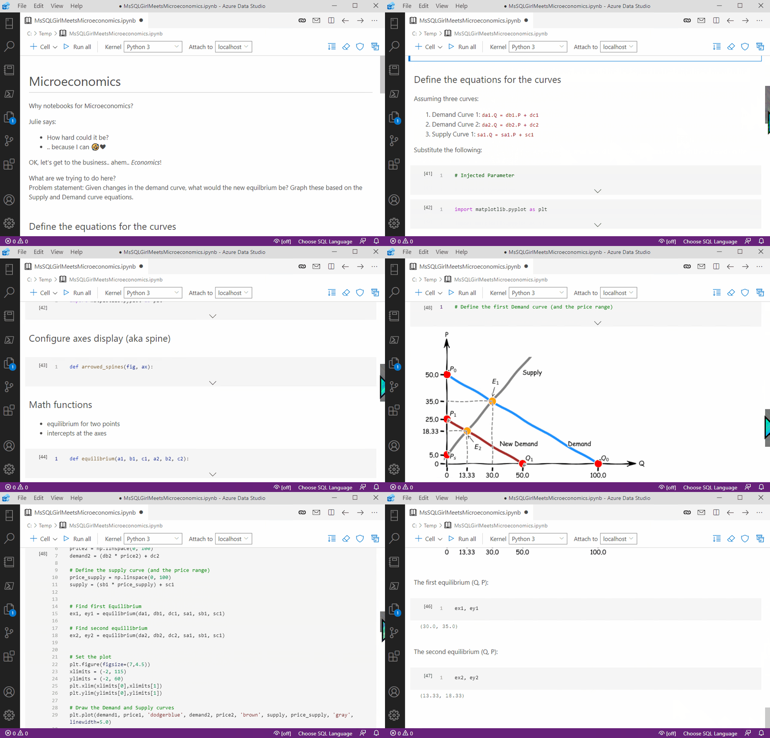
This month’s T-SQL Tuesday is being hosted by Steve Jones (b|t). The topic is using Jupyter Notebook every day. As Steve describes it, “I want you to write about how you have used, or would like to use, a Jupyter notebook“. This is a super cool topic! Yes, I’m a PM working on Jupyter Notebook in Azure Data Studio along with my peers; and we can’t wait to see people’s posts on this. 🎉

Since I’m late in submitting 😅, I thought it’d still be OK for me to share how I’ve used Jupyter Notebook recently and generally. The question is, what do I do everyday? Learn! So this blog post is about how to use Jupyter Notebook to become a better learner (me and hopefully others too).
Hope you bear with my non T-SQL side of me for a bit here in this blog post. If you want to see how I use notebooks specifically for T-SQL, KQL or PowerShell for data professionals, check out my repo. Most of these are also results of my past learnings – sometimes on how to use Azure Log Analytics, sometimes KQL, sometimes PowerShell and some other times to do data analysis using T-SQL – so that I can then share with you as examples or for demos.
OK, let’s get going with how I used notebooks recently, specifically using Azure Data Studio!
“How hard could it be?”
I love learning! What I love most about learning is when it has practical applications. Jupyter Notebook gives me that ability to do so – no fuss, especially in Azure Data Studio. Here’s my learning quest, I want to be able to create a typical chart from an introduction to microeconomics class, that I can easily reuse for later. My challenges~
- I’ve only sporadically learned Python. I want to be better in Python.
- One of my new (learning) passions is Microeconomics.
- It’s been a while since I did Math. It turns out Microeconomics has a bit of Math (linear algebra and calculus to be specific – yay!). I want to learn it again.
How hard could it be? Eeek! Essentially, how hard is it for me to do microeconomics charts with Python? Well, there is only one way to find out. I’ve decided to use Notebook as a vehicle for me to learn more about Python (new-ish), Microeconomics (new) and Math (revisiting).
Tip: If you’re new to Azure Data Studio and notebooks, watch a quick segment on how to install Azure Data Studio and get Jupyter Notebook up and running here. (The installation portion should take about ~3 minutes)
Here it is a quick video of the final outcome of my notebook showcasing a microeconomics chart of a market when there is a change in demand:

What have I learned?
- Notebook in Azure Data Studio allows me to simply get hands on coding and get busy with the learning how to create charts in Python and the Microeconomics bits.
- What’s it like developing a notebook? Since I have to do a lot of start and stop while jotting down ideas, I can do that easily with text cells in the notebook. A better learner in a progressive manner!
- What’s cool? I actually use git in Azure Data Studio for versioning my notebook file! Yay for reverting back to my messy working code.
- What’s the hardest part of this journey? Learning how to label my chart, and to make it microeconomics like (as a bonus, since I like XKCD, let’s throw that in there too) 🙂
- How long did it take me to do? Around five hours to make it to the level that I was happy with (accurate, appropriate placement on annotations and labelling). The first chart took me about less than an hour. The rest of the time really tweaking to make things more parameterized, more dynamic, aesthetic enhancements and the typical dev questions. “Should I build my own math library here? Should I extend this so that it works for other curves that require a bit more calculus?”. Big thanks to python – matplotlib axis arrow tip – Stack Overflow for helping me create more mathematically accurate representation of axes! Note: since I’m newish to Python, there might be some economics or math packages that I could have used. In this instance, I used matplotlib and wrote additional modules / functions for most of the equations for the chart.
- How reusable is it? Give me a Supply and two Demand curve equations, I can produce the chart in seconds.
- What’s next? I haven’t made this specific notebook “too” dynamic yet. Positioning annotations can be a little tricky – I need some more math thinking space 🙂 I’d also like to do other microeconomic curves one day.
Yay! So now, I’ve added Python for Microeconomics in my list of use cases I learned, on top of my usual data analysis/wrangling/coding with T-SQL, KQL and PowerShell with notebooks.
Summary
In this blog post, you’ve learned how I use Jupyter Notebook in Azure Data Studio for my every day activity – learning! This time around, it happens to be on using Python for a microeconomics chart with Supply and Demand curves. I love the versatility and the no-fuss aspect of Jupyter Notebook in Azure Data Studio. I can use and have used it to learn and show case T-SQL, PowerShell, KQL and – most recently as covered in this blog post – Python for microeconomics.
Notebook allows me to be a better learner: write what I’ve just learned, be kind on my future self by documenting my half baked ideas (and being able to revisit plus tidying it up with minimal context loss), show examples and making my notebook reusable!
Happy learning with notebooks in Azure Data Studio. Stay healthy and be kind.
No responses yet